Zoe Yin Design Thinking

Learning experience and design thinking of Master of Design for services in DJCAD


Leave a comment

Think beyond the screen- it’s about more than efficiency. It’s about quality of life

Microsoft’s Vision Of The Future Is Trapped In A Box is one really insightful article from Co.Design. It discusses the Microsoft’s latest vision for the next decade with a very critical thinking. The vision looks very cool at first, however, it also ignores some emotional aspect of people’s life in some extend. I’m not quite against screens and believe screens will help our life turns smarter. But this article reminds me that maybe I’m also one of people who get lost in all those screens.

Lion&girl

“And here we see the saddest moment. A little girl supposedly ignores her adorable, plush lion for a poor facsimile on a gigantic TV, surrounded by a dozen digital picture frames. Digital picture frames?? Is anyone still making those?”

Ivan Poupyrev, one of head researchers of Disney Research, said “Maybe remote controls are more efficient, but in living spaces, it’s about more than efficiency. It’s about quality of life.” The problem of those screens is that life of human-beings is complex. We need more senses to be explored, more emotions to be cared, more relationships to be considered.


Leave a comment

Digital Service Design: Lessons from the Cloud- Continuum

Digital Service Design: Lessons from the Cloud is an article published on Touchpoint from Continnum. It discusses the balance between digital and non-digital aspect of service design. Consistent experience delivery is emphasised in this article and it “involves a translation of your business’s core essence to each touchpoint”. The author says “Service Design ‘in the cloud’ is not about slapping on a Facebook page or about merely digitizing information” but about “balancing design craft, organisational innovation, systems management, and new digital technologies in the entire context of Service Design, while keeping the human connection in mind.” This is very useful for my project to remind me to keep user-centered design in mind and keep myself from lost in technology elements.


Leave a comment

User-centric IDM- some critic thinking from Malcolm Crompton

User-centric identity management: An oxymoron or the key to getting identity management right? is one article from Malcolm Crompton which discusses IDM issues related to user-centered design with critical thinking. It emphasizes the importance to consider end-users in IDM:

“There is little doubt that a use centric approach will be the key to success in getting identity management right. Solutions must ensure:

– that the focus of management is not just on the interests of the organisation, but the interests of the user as well;

– The solution must establish mutual trust.”

What’s more meaningful, the article gives me the insight that users should not be left with too many decisions to make, and the level of user control will vary depends on various contexts- if the accountability of the organization is build very well, then users’ concern and need for self information control will decrease. This reminds me that only make user have control of IDM is not enough. If all control decisions are left to end-users without considering the diversity of control levels, the situation will be like that all responsibility is shifted to users and lead to more anxiety for them. Therefore, consideration of context and scenarios of IDM before is necessary.


Leave a comment

Build a long-term identity management

Here is a new article I read recently, Identity management throughout one’s whole life. It mentions a concept called “partial identities”- an individual typically appears under different partial identities for work, others for leisure activities, or dealing with companies. And this figure below is one example from the article, Partial identity of John.

partial identity of John

The author of this article thinks identity management system which contains mechanisms for user-controlled privacy, covering all areas of life, covering all stages of life and covering the full lifespan should be designed. Long-term identity management is what people may not consider much before. Like when I first register Renren, the Chinese Facebook, I didn’t realize that it will store my personal data for six years and longer. Maybe it’s too extreme to think that one website or app will relate to our whole long life, however, some of them may actually act as a storage space and show platform of our personal life for a long time. Ourselves and our relationships with others and the whole society changes quite often in the contemporary era. Like when we were freshmen, everything is interesting and we liked to share many pictures and states with peers, but as we are moving closer to the professional world, much more things should be considered on the social medias.

Renren, the Chinese Facebook, launches a new widget in the second half year of 2012. It is a photo widget which automatically shows pictures which were uploaded in the same day of several years ago. And it’s immovable, no matter which part you are scanning one the news page, it’s always there, turning over photos. This widget is nice and warm when you find moving photos your friend uploaded three years ago, however, its also very awkward and scary to see unseemly funny pics of yourself five years ago or find your boyfriend’s joint photo with his ex four years ago. Sometimes we just throw our personal information into social medias and don’t know how to mange it as it becomes too huge to organize. And sometimes the problem of identity management is not how to build more but to delete some. When I set a small survey on Weibo (Chinese Twitter) to ask for friends opinion of the widget I mentioned above, several said they don’t like that widget and one of my friend even provides me a plug-in to delete that album.


Leave a comment

Identity management- back to the user

note0212

Identity management- back to the user(Roger Dean) is a very good article from Network Security. It lists lots of cases of technology applications which focus from user’s point of view of identity management. Here are some notes I made from the article:

  • Learn from government: Case studies could be taken from government, because they are the real expert of identity management of large population and care much of identity security;
  • Paradox exists: users who are too afraid of Internet security are the two most popular vectors of attack- Services which helps and encourages users to appropriately manage their digital identity by themselves may work for better identity management;
  • Sometimes the problem of identity management comes from that people who develop the system are not users who may suffer the security issues- Services make developers or organizations care more about user’s identity management experience may help to solve some problem;
  • Give users real control: users need to and should get control of their own identity, like building a database of users’ own identity data and let users choose how to use them for different networks may cause better user experience.


Leave a comment

More and more mobile devices

iwatch2

Cisco has published its Global Mobile Data Traffic Forecast. It says the total number of mobile devices within five years will be more than the total population, and 2013 will be the critical point. Today I also find news saying that Apple are testing iOS running on smart watches. From all these news there is a obvious trend of possibility of expanding mobile devices, especially relates to wearable smart devices.

If people start to have more and more mobile devices then what the identity management will look like? Our mainly problem of dealing with individuals getting access to networks may turns to tokens such as watches. Like when I use laptop or iPad, I prefer to let the devices remember all my frequent accounts and passwords and just add passwords for those devices. Therefore maybe in the near future, my big problem of identity management is to remember all the passwords for my various mobile devices.


Leave a comment

Develop more thinking before visualization

The back of the napkin is really a good book for visualizing research. It emphasizes that every person is able to grab a pen and draw to solve different kinds of problems. The lecture and huge amount of visual exercises we have today is a start for me to rethink visualizing research. For academic purposes visualization is not for fun and less for showing things, it’s more important to use simple, clear and direct sketches to communicate and develop ideas. And quote from The back of the napkin “The real good of visual thinking is to make the complex understandable by making it visible.” Many cases in this book prove that how strategic and analytical simple sketches could be, just like the picture followed:

tbotn-codex

The content in the book and also the exercises we have today remind me that actually for red pen people (who refuse to consider themselves as visual people) it’s easier to transform to black pen people (who are happier to draw things) if they find and follow the right visual steps and patterns, however, for black pen people (I’m one of them) it may be harder to establish good visual thinking ways and generate great visual works for research because they may haven’t got the analytical way of solving problems in their minds. Therefore, like what we did today as we were trying to visualize something, deeper thinking about the information you want to convey and develop your mind structure firstly is very important.

More reflection of The back of the napkin is here https://yzoedesign.wordpress.com/2013/01/12/the-back-of-the-napkin/

Today I also tried to improve my sketch skill by adding more colors for our group sketches:

groupsidx5


Leave a comment

Impressed by how professional it could be among social networks

Using social networks in a professional way may cause the result of academic or business ecosystems in the open and casual social network context. That requires the owner of social networks to strategically organize the information conveyed through websites. The owner may categorize various websites into different functions, such as use Facebook to contact with families and use twitter to meet new people. And for one specific network the owner needs to carefully edit all the information on areas like personal profile or messages he or she send through it. Main considerations are needed such as make clear what’s the purpose of social networks, what information the owner is looking for or expressing out, how the owner may manage the networks like the update frequency and what kind of media the owner wants to use (audio, video, words or images).

digital ecosystems-2

On the other side, digital tools play an important role to help people find professional information from other’s social networks such as search for academic resources, public topics or business strategies. The searcher may generate a persona which contains his or her valuable characters needed for the project after the objective of the searching, people group who may contribute to the objective has been decided. Then through tools like Twitter search engine, Storify and Google Adword Keyword Tool the searcher can find the appropriate people and strike up conversations.

From the lecture we have today I see how social networks play a role in very professional uses. And this also makes me consider culture differences among social networks, for example it’s rarer to see people use Weibo (Chinese Twitter) or Renren (Chinese Facebook) to discuss academic topics or business thinking (the business accounts focus more on advertising competition). In fact it’s quite useful and important for people to share opinions and insights of professional issues online and social networks should be strong and efficient tools to put it into practice.


Leave a comment

The back of the napkin

back_of_napkin_book

This book is a really great one relates to visual thinking. As I always worked as the visual sketcher of the group in last semester, the content in this book attracts me a lot in the first eye. Before I come here, the study back home does not advocate visual elements especially in industry design because the academic didn’t want us focus much on them but more on the structure and function elements of products. However, the study in UK provides me lots insights of how visual thinking could help express and generate meaningful ideas.

Before I forget anything, this blog is a good space to place some notes of this book.

Firstly, the author (Dan Roam) introduces The six problem “clumps”.

The six problem clumps

They are quite familiar to us design students because they are just the famous Ws. But in this book I could see more roles they play in the design process. In the later chapter while the author talking about visual thinking these six problems repeat a lot as important elements of all complex issues.

The process of visual thinking

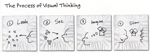
Then here is the introduction of The process of visual thinking. These steps look quite simple but through the real business cases the author proves how they work well in different contexts. What I could find very useful here is that the “Show” step is actually the last step of visual thinking. That means we don’t need and shouldn’t focus too much on the show problem in the earlier stage. It’s true that design students are more disposed to think more about how to show to clients before anything had happened but as critical thinker we should try best to avoid it and follow the right flow in case of the loss of the real valuable information.

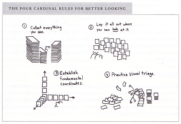
Next The four cardinal rules for better looking is also familiar to me especially after experiencing the study in the last semester. Collect everything you can and lay it all out where you can look at it, and then establish fundamental coordinates (analyze) and finally practice visual triage. The whole process is just like the project we did in our MDes Studio. The most different thing I could find here is the coordinates step. And I still think it may be more and more approaches to analyze the data (maybe the strategic information design Module could give me more answers about this part) but for business use these four steps for looking should be enough.

The four cardinal rules for better looking

Then there are sentences in this book really enlighten me which are

“One of the most important virtues of visual thinking is its ability to clarify things so that the complex can be better understood, but does not mean that all good visual thinking is about simplification.”

“The real good of visual thinking is to make the complex understandable by making it visible- not by making it simple.”

I still remember that the service designer of 21th century should be: Mediator of stakeholders; navigator of complexity; communicator of value; facilitator of thinking; visualizer of intangibles; and integrator of concepts. And this book successfully links the rule of navigator of complexity of service designers to visual thinking and simple sketches. It reminds me that the real purpose of visual thinking.

Then there is very interesting concept of <6><6> module. The see steps relate to the six problems the author mentioned in the first chapter of this book and this module transfers the see step to show step in a clear way. Still, I believe that we could create many more appropriate approaches to show the final result, which need to be well designed. But the six show ways mentioned in this book are enough for most business issues. Besides, the author mentions that there could be combinations among the graphs, which I believe must happen a lot in the real world. Therefore there may be much much more possibilities of the results of see step and all of them should depend on various contexts of the projects.

6-6model

Then the author introduces S.Q.V.I.D. It represents different two aspects of how we see different issues and when combined to <6><6> module it turns to be The visual thinking codex:

The visual thinking Codex

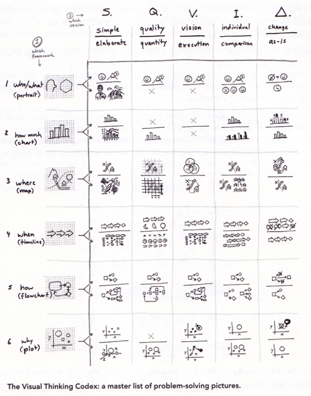
From the big table, it’s clear that our author uses a very strategic method to progress visual thinking. This codex, as the author said, almost contains all business issues in the real life. We could choose one or more problems from the <6><6> module firstly and then consider the S.Q.V.I.D to find the best graph to show. Therefore if we followed the author’s steps in visual thinking, the final show result will appear automatically and followed a very critical consideration. What we need to do is to make it clear of what to do in different steps of the whole process and then we could get the best result of it. I know it will be much more complex when we need to deal with any real issues in projects because it’s just too difficult to make anything clear and it must contains lots of evaluation when we choose anything. For me, this book is not the final guidebook I will follow in the future but great inspiration of visual thinking: I need to generate my own process, keep it simple and clear, make full use of visual elements but should not forget their real functions.


Leave a comment

Information is Beautiful

These days I’m reading Information is Beautiful and The Back of the Napkin in the same time. It’s interesting because these two books focus on the same theme in quite different ways- they all want to solve the problem of complexity of information, while the former make use of digital visualization and the later make use of quite original and emotional hand sketches.

It’s quite true that all the information we need to face currently is becoming more and more complicated and add our mind pressure in some extent. And I agree that both digital and sketch visualization are great ways to work on information design- depends on the context of the information and tasks. However, in the book of Information is Beautiful I found that some of the pictures contain too many words, graphs or are just too abstract to be really understood and I wondered if they will lose the real meaning of infographics. I prefer the pictures with simple shapes, clear colors and less words which express the information in a quite neat way. And there are many good examples in this book such as the following coffee example. In a word, Information is Beautiful is a wonderful book which contains quite beautiful and modern infographics, focuses on many interesting content of information and really helps to generate interests in the area of information design.

Types of Coffee— Types of coffee